Feature-Sliced Design (FSD): Architectural Standard for Modern Frontend Applications
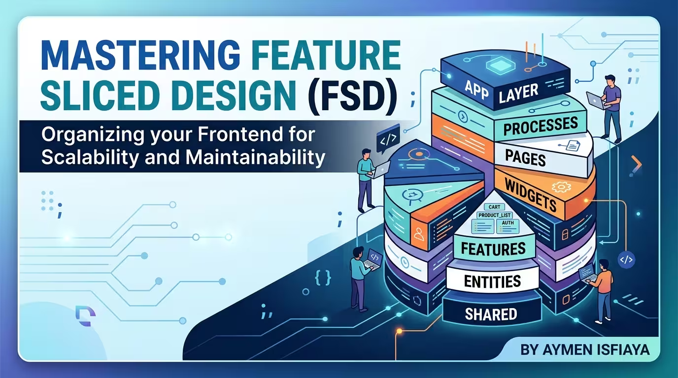
Feature-Sliced Design (FSD): Architectural Standard for Modern Frontend Applications 🏗️
As frontend applications grow in scope and complexity, keeping codebases modular, maintainable, and resistant to technical debt becomes a major challenge. Standard folder structures like grouping by technical type (components/, hooks/, services/) quickly break down when project scope expands. Developers end up dealing with circular dependencies, tightly coupled code, and massive refactoring headaches.
Enter Feature-Sliced Design (FSD) an architectural methodology for frontend applications designed to make codebases scalable, predictable, and team-friendly.
In this guide, you'll learn:
- 🧱 What Feature-Sliced Design (FSD) is and why it was created
- 📐 The three core pillars: Layers, Slices, and Segments
- 🔄 The strict unidirectional dependency rule
- 📦 The power of Public APIs (
index.ts) for clean encapsulation - 💻 Real-world directory structure and code examples in React & TypeScript
- ⚖️ How FSD compares to traditional frontend architectures
What is Feature-Sliced Design (FSD)?
Feature-Sliced Design (FSD) is an architectural framework for frontend web applications. It provides explicit guidelines on how to structure code, group logic by business domain, and control dependency flow.
Unlike traditional architectural patterns that focus purely on technical concerns (e.g., separating HTML, CSS, and JS), FSD structures applications according to business requirements and user value.
Primary Goals of FSD:
- Scalability: Seamlessly add new features without breaking existing code.
- Predictability: Standardized structure allows developers to instantly locate files across any FSD-compliant project.
- Controlled Dependencies: Prevents spaghetti code and circular imports via strict directional rules.
- High Cohesion & Low Coupling: Business logic is localized within domain boundaries.
The 3 Pillars of Feature-Sliced Design
FSD organizes code into a three-level structural hierarchy: Layers, Slices, and Segments.
📁 src/
  ├── 📁 app/          (Layer 1 - Top)
  ├── 📁 pages/        (Layer 2)
  ├── 📁 widgets/      (Layer 3)
  ├── 📁 features/     (Layer 4)
  ├── 📁 entities/     (Layer 5)
  └── 📁 shared/       (Layer 6 - Bottom)
1. Layers
Layers are the top-level structural divisions. They are arranged in a strict top-down hierarchy based on domain specificity:
| Layer | Responsibility | Examples |
|---|---|---|
app | Application initialization, global providers, routing, global styles | app/providers, app/router, app/styles |
pages | Full view pages composed of widgets, features, and entities | pages/home, pages/profile, pages/catalog |
widgets | Self-contained, complex UI blocks combining features and entities | widgets/header, widgets/sidebar, widgets/product-grid |
features | User scenarios carrying explicit business value to the end-user | features/add-to-cart, features/auth-by-email, features/search |
entities | Real-world business concepts and models | entities/user, entities/product, entities/order |
shared | Business-agnostic reusable code, UI components, utilities | shared/ui (Button, Input), shared/api, shared/lib |
2. Slices
Inside layers like pages, widgets, features, and entities, code is split into Slices. Each slice is named after a specific business entity or feature domain.
📁 entities/
  ├── 📁 user/        <-- Slice (User domain)
  ├── 📁 product/     <-- Slice (Product domain)
  └── 📁 order/       <-- Slice (Order domain)
Note: Slices are not present in the
apporsharedlayers, as those layers contain application-wide or business-agnostic code.
3. Segments
Inside each slice, code is organized into Segments based on technical purpose:
ui/: UI components, visual components, styles, and animation logic.model/: Business logic, state management (Redux, Zustand), hooks, selectors, actions, and types.api/: API queries, data fetching handlers, mutations, and requests.lib/: Helper utilities and transformers specific to this slice.config/: Slice-specific constants, configuration, and feature flags.
📁 entities/product/
  ├── 📁 ui/          <-- ProductCard.tsx, ProductPrice.tsx
  ├── 📁 model/       <-- productSlice.ts, useProduct.ts, types.ts
  ├── 📁 api/         <-- fetchProduct.ts
  └── 📄 index.ts     <-- Public API
The Strict Dependency Rule 🛑
The defining mechanism of FSD is its unidirectional dependency rule:
Rule 1: A layer can ONLY import code from layers strictly BELOW it.
For instance:
pagescan import fromwidgets,features,entities, andshared.featurescan import fromentitiesandshared.entitiescan ONLY import fromshared.sharedCANNOT import from any layer above it.
   [ app ]        ⬇️ Top layer (imports everything below)
      │
   [ pages ]      ⬇️
      │
  [ widgets ]     ⬇️
      │
  [ features ]    ⬇️
      │
  [ entities ]    ⬇️
      │
   [ shared ]     ⬇️ Bottom layer (imports nothing above)
Rule 2: Slices on the SAME layer CANNOT import from each other.
For example, features/add-to-cart cannot import from features/auth-by-email. If two features share code, that logic should be extracted down to entities or shared.
This rule completely eliminates circular dependencies and guarantees modularity.
Encapsulation via Public API (index.ts)
In FSD, every slice and segment must expose an explicit Public API via an index.ts file. External code must ONLY consume imports exposed by this Public API.
Bad Practice (Deep Importing ❌):
// ❌ Violates FSD encapsulation! Deep importing internal implementation details.
import { ProductCard } from '@/entities/product/ui/ProductCard';
import { useProductStore } from '@/entities/product/model/store';
Good Practice (Public API Importing ✅):
// 📄 entities/product/index.ts (Public API)
export { ProductCard } from './ui/ProductCard';
export { useProductStore } from './model/store';
export type { Product } from './model/types';

// ✅ Clean, encapsulated import from external layer!
import { ProductCard, useProductStore } from '@/entities/product';
Practical Code Example: E-Commerce Product Feature
Let's look at how a feature like "Add To Cart" is structured in an FSD project.
1. Entity Layer (entities/product)
// entities/product/model/types.ts
export interface Product {
  id: string;
  name: string;
  price: number;
  imageUrl: string;
}

// entities/product/ui/ProductCard.tsx
import React from 'react';
import { Product } from '../model/types';

interface ProductCardProps {
  product: Product;
  actionSlot?: React.ReactNode; // Slot pattern for actions
}

export const ProductCard: React.FC<ProductCardProps> = ({ product, actionSlot }) => {
  return (
    <div className="product-card border rounded-lg p-4 shadow-sm">
      <img src={product.imageUrl} alt={product.name} className="w-full h-48 object-cover" />
      <h3 className="text-lg font-bold mt-2">{product.name}</h3>
      <p className="text-gray-600">${product.price.toFixed(2)}</p>
      {actionSlot && <div className="mt-3">{actionSlot}</div>}
    </div>
  );
};
// entities/product/index.ts
export { ProductCard } from './ui/ProductCard';
export type { Product } from './model/types';
2. Feature Layer (features/add-to-cart)
// features/add-to-cart/ui/AddToCartButton.tsx
import React, { useState } from 'react';
import { Button } from '@/shared/ui';

interface AddToCartButtonProps {
  productId: string;
}

export const AddToCartButton: React.FC<AddToCartButtonProps> = ({ productId }) => {
  const [loading, setLoading] = useState(false);

  const handleAddToCart = async () => {
    setLoading(true);
    try {
      // Execute add to cart API call or store update
      console.log(`Product ${productId} added to cart!`);
    } finally {
      setLoading(false);
    }
  };

  return (
    <Button onClick={handleAddToCart} disabled={loading} variant="primary">
      {loading ? 'Adding...' : 'Add to Cart'}
    </Button>
  );
};
// features/add-to-cart/index.ts
export { AddToCartButton } from './ui/AddToCartButton';
3. Widget Layer (widgets/product-grid)
// widgets/product-grid/ui/ProductGrid.tsx
import React from 'react';
import { ProductCard, Product } from '@/entities/product';
import { AddToCartButton } from '@/features/add-to-cart';

interface ProductGridProps {
  products: Product[];
}

export const ProductGrid: React.FC<ProductGridProps> = ({ products }) => {
  return (
    <div className="grid grid-cols-1 md:grid-cols-3 gap-6">
      {products.map((product) => (
        <ProductCard
          key={product.id}
          product={product}
          actionSlot={<AddToCartButton productId={product.id} />}
        />
      ))}
    </div>
  );
};
FSD vs Traditional Architectures
| Criteria | Classic (By Type) | Feature-by-Feature | Feature-Sliced Design (FSD) |
|---|---|---|---|
| Structure | components/, hooks/, api/ | features/user/, features/cart/ | app/, pages/, widgets/, features/, entities/, shared/ |
| Coupling | High (everything imports everything) | Medium (cross-feature leaks) | Low (strict directional rule) |
| Scalability | Hard to scale past 20+ pages | Moderate scalability | Highly scalable across large teams |
| Onboarding | Requires learning custom conventions | Depends on team practices | Standardized & predictable |
| Refactoring | High risk of unintended side-effects | Moderate risk | Safe (isolated slices & public APIs) |
When to Use Feature-Sliced Design?
Recommended For:
- Medium to large-scale web applications.
- Multi-developer and multi-team frontend projects.
- Applications with complex business domains and long lifecycle expectations.
Not Recommended For:
- Simple landing pages or small CRUD apps (the boilerplate can be overkill).
- Tiny prototypes or hackathon projects where speed is favored over structure.
Summary & Key Takeaways 🎯
Feature-Sliced Design brings discipline, structure, and enterprise-grade scalability to modern frontend development.
- Organize your code into 6 standard layers:
app➔pages➔widgets➔features➔entities➔shared. - Keep business domains isolated inside Slices and split technical logic into Segments.
- Always respect the top-down dependency rule and avoid cross-slice imports at the same layer.
- Enforce encapsulation using Public APIs (
index.ts).
By adopting FSD, you turn complex, tightly coupled codebases into modular, easily maintainable software systems!

Written by Aymen Isfiaya
Senior Frontend Developer & Atlassian Forge Specialist sharing web dev techniques, React patterns, and cloud extension insights.